Pages

GO TO YOUR ROOM !

I borrowed this phrase from the recently deceased Canadian painter Robert Genn who believed that there is only so much we can learn about how to paint from the many fine instructors and resources available today. The true learning comes from going off on our own and just doing it - Go to your room!

I have had the good fortune to take instruction from outstanding artists in Canada and the USA. I continue to work on my own development ( Going to MY room!) . I share, through this blog and workshops, what I have learned and what others have shared with me.

I created this blog primarily for those attending my workshops to keep in touch and to further share as we grow together. If others are interested in following that would be great.

Enjoy the journey.

Wednesday, 21 March 2012

Back to Black!


Nothing to do with music of the sadly departed singer Amy Winehouse.


I am reading Betty Edward's book Colour:  A Course in Mastering the Art of Colors.   This is an excellent book, an introduction to working in colour for new painters and a good  refresher for those with experience. Lots of good exercises for the new painter. Very well thought out.


But what struck me is her support for the use of black. Probably the colour that illicits the strongest opinions on it use. I would guess that half of my instructors included it on their palettes and the other half were evangelically against using it. She presents good reasoned arguments on its use to dull colours, to create very useful greens and browns. You can't get darker than black so it is great for those dark accent areas particularly  -  but you need to  spice the black up by adding mixtures such as magentas,  blues, greens etc to move it from the flat back to  create more interesting darks.  


The argument I have heard against it is that you simply don't need it - you can mix great darks - ultramarine blue and burnt sienna, dark reds and dark greens etc. That's true. But that is still no reason not to include it - THERE ARE NO RULES. I particularly like its convenience in plein air work when I am under time pressure - I can more often get to the grayed colour  of a particular value going through the black route. I NEVER use black unmodified - its just too flat. 


For me, I stick with ivory black - it is transparent and less " potent" that the opaque backs. In addition to its use in mixing  I often include it in acrylics glazes - thinned greatly with medium and water and often modifying it with a touch of colour ( thalo blue green as an example). Used with caution it is great for dropping the overall value and saturation of some areas of a painting or the entire painting. Need to follow up the down glazing by making some of the areas pop with more colour and value variation by using a variety of opaques.  


Just for fun, if you suffer from black phobia, try adding a small bit of ivory black to some of your reds and oranges to move them to browns. Try mixing greens with a variety of different yellows. Try dropping the value and saturation of colours by adding just a touch of black. Not too scary !


Saturday, 17 March 2012

Saved From The Dark!


I love working in acrylics. I have become comfortable and somewhat confident that I can work through the bad stages in most of my paintings and come out OK - at least OK enough for my stage of learning. I have confidence that I can  make changes and test new ideas and get immediate feedback - because of the fast drying time. I like experimenting with different paints - in acrylics that means different viscosity and manufacturers with specific claims. Some claim slower drying times etc. and I will post my opinions about these in a future post.


My biggest issue with acrylics is not drying time - but that they dry darker. This is not an issue in most cases - I can cope. I have jars of premixed colours of known drying values ( painted on their lids) and as most of what I do in acrylics are land and sea scapes I can live with a degree of inaccuracy.  But every once in a while I  become really frustrated that the final product dries darker than I expected. 


Winsor & Newton's new Artist's Acrylic paints boasts that they dry without value change. So I decided to give them a try. I purchased about 20 tubes of colours - a mix of lights (mostly opaques ) and darks ( mostly transparents) and put them to the test. I mixed a small pile of colour on a Stay Wet palette. I painted a round spot of colour on a gesso treated canvas board and dried it with a hair dryer. Took  photo 1 below. Then painted one stoke of fresh wet paint from the piles onto and out from the round colour spot and immediately took  photo 2. The wet and dry were of the exact same colour and value - I could not detect a difference live or in photo. 


Dry Paint 

Wet Paint stoke added to dry paint

WYSIWYG   What Ya See Is What Ya Get


I have used the product off and on since and am content in the belief that there is no value change. This has potential advantage for tight work - portraiture etc. 


Anyone else found the same or different? 

Monday, 12 March 2012

Great Little Gadget!

Manfrotto on Easy L 

Getting back into the plein air mode. Just off a Preparing for Plein Air Workshop and with the weather starting to improve I am getting itchy to get out and at it. One little gadget that I wanted to share that has been very useful to me but I rarely (like never) see others using. 


I cannot encourage too strongly, particularly in plein air,  making small value sketches to establish your plan before you get out your paints. Sometimes half a dozen sketches before you have what you want to work with: size of fore, mid and background; value dominance, etc. The trick then is to stick with that plan once the painting begins - and not get distracted back to the scene where you are in danger of chasing shadows, cloud shapes etc. To make that work you need a convenient way to have your reference sketch there for you. 


The best I have found is the Manfrotto Double Spring Clip. They seem expensive but are well constructed. I have a half dozen - one in each kit and two in the studio - I  have never had a problem so I think they are good value. I got mine from Judson Plein air. Good company with good service. 


The sketch pads I use are Strathmore Drawing 4x6 inches. 


Something to consider. 


On Soltek easel. 


Tuesday, 6 March 2012

Join Me! Blog Talk Radio - Artists Helping Artists


I have just been invited to be one of the guest artists on this week's Artists Helping Artists on Blog Talk Radio - Thursday morning from 9-10.  I am pleased and honored.  The topic  is Late Bloomers - apparently that's me. 


More about this week's show in a bit - but if you are not familiar with Artists Helping Artists you probably should be. 


Artists Helping Artists  airs each week. It is hosted by two energetic and highly skilled artists Leslie Saeta and Dreama Tolle Perry. The show focuses on the business side of art but also has informative and fun interviews with highly successful artists - recent examples include Robert Genn,  Carol Marine and Jennifer Christian - I mention those three as examples of artist who I have taken workshops from and who are wonderfully open , sharing what they know. 


How did I got into Artists Helping Artists? Before the end of last year I decided that I would give on-line marketing and self promotion a try. We are moving from British Columbia and all my Vancouver Island art contacts, and returning to Ontario where are sons and grandchildren live. I was hoping that on line profile might be useful in " starting over". But I did not know quite where to turn for help. I had tried Facebook a few years prior and felt it was just not for me. I had heard about their radio show and took a look at the many programs available for listening ( each week's  program is stored and cataloged). Their programs and their own energetic self confidence helped me to get into it all - Facebook, Linked in, Daily Paintworks, Twitter and to start blogging. For better or for worse I have taken the plunge and so far it has been rewarding and a real learning experience.


So if you are not aware of Artists Helping Artists I strongly encourage you to take a look at the long list of topics. It is so easy. I listen in my studio, use my tablet when working outside, when waiting for the ferry, etc. 


You can look it up on Facebook and Like it - to keep current with new  shows. 


As for the show this week, if you are interested in listening in, simply follow this link Artists Helping Artists Thursday March 8. 


Scheduled Air Date: Thursday, March 8, 9:00 am PST, 12:00 noon EST.
"Late Bloomers ... Starting Your Art Career When the Kids are Grown"
Join artist and marketing expert Leslie Saeta as she highlights ways to sell your art on-line. On today’s show Leslie is joined by AHA March co-host Kathy Cousart. Join Leslie and Kathy as they share their personal "late bloomer" stories and interview artists Pam Holnback and Brian Buckrell. On today’s show we will discuss how many artists have become very successful, after the kids are grown!
To access the show,


Monday, 27 February 2012

Preparing for plein air - Workshop


Completed my first Preparing for Plein air Workshop on the weekend. Had a great group of enthusiastic plein air wana-bes. 


To fully enjoy painting on location you need to have a reasonable level of painting skills before you try to tackle the challenges of plein air.  But even with those basic skills plein air is intimidating. So the focus was on planning. Making choices of what to include or eliminate, establishing horizon lines and playing with space division - fore mid and background. All this and more can most easily be learned with pencil and pad.


 I think most would advance by sketching on location - making various interpretations of the scene, making a final selection of their composition of choice, taking photos - then returning to the studio to apply the paint under more controlled conditions until they felt comfortable and confident and were properly equipped to complete paintings on location. 


As for me, I am spending more and more time simply sketching on location - working to improve my eye  and my compositions. 


It was a fun weekend. I enjoy the enthusiasm of a group of  artists working together and being challenged with new ideas. 


My thanks to Island Arts Magazine for organizing the workshop. 

Thursday, 23 February 2012

No more tea cups!


 I left off last post trying decide about material I could use for quick studies in oil to work on some of the techniques that Carol  Marine demonstrated.  I might have found it. I have had the good fortune to have traveled extensively in my previous life and have some interesting photos of  people and faces (and lots of cows and sheep). And our good friends the Ulmis have given me wonderful photos of their many travels to exotic places. So I thought I might try quick studies of faces - "faces of the world".  


Great challenges in small format and no different than an apple or orange for creating form and playing with edges. So these are my first attempt. Goal is to be playful and create impressionistic feel. 

Both 6x6 on acrylic primed linen glued to door-skin.

Also, tried a softer brush - a Connoisseur White Taklon - brights 6 and 8  - and liked them on the linen. Goal is to complete in less than an hour - these about 45 min each.

These are from two Ulmi photos from Tibet.

 Hoping to do two or three a week .

Quite fun to do.


thin wash of Indian Yellow and Alizaran Crimson  -paint water  soluble oil 


Wednesday, 22 February 2012

So, what did I learn from Carol Marine?

When I say I learned it - well, that's a wee bit of an exaggeration. Learning it means I can now do it. So lets call it the list of things she does that I find interesting and worth working on - thinking they would help my work - both oils and acrylics. Got to remember she is painting small still life - 6x6 panels- and subject is a variety of small objects with strong lighting.

1. Composition.  Carol spends a great deal of time designing her compositions. Very thoughtful of positive and negative - a shape is a shape. Used overlap a reinforce a feeling of depth in such as small space. She uses three point perspective - narrowing tall vertical elements as they descend (like a sky scraper in mirror image) again to add dimension and depth to her small setups. She considers colours (value, hue , temperature ) of her objects and uses them to effect.  Very thoughtfully done.

2. Palette.  Carol is probably as good as anyone I have seen working with a limited palette and mixing in a highly organized fashion. Small pools building on one another modifiying hue, saturation, temperature and value very subtly.

3. Grays. She is a master of subtle grays. I make grays in two ways: the traditional combinatin of compliments and adding white as needed, or using pre-mixed grays of know value and adding hue as needed. She starts with three primary hues: red, yellow and blue. She plays with a variety of each - warm yellow on cool reds, etc.  She modifies the temperature and hue direction of these grays as required. They are very subtle and sensitive when applied to the palette.

4. Overall value. Her dominant value is generally in the mid range. Many of her paintings are subdued with high values held in reserve until the final kick. When she applies her highlights (usually applied on a small spot of transitional value below) they JUMP off the canvas. Highlights are a mix of white, the color of the object and the colour of the light source.


5. Edges. This is what I love the most. Carol builds each object from the center using a fairly heavy load of paint. She then feathers (thins) the paint out beyond the edge of the object at points. When she carves the back-ground/negative spaces around the object it creates a transition that is interesting and high in "energy".
6. Shadows. Like above, Carol uses great transitional values and colour to bring her shadows to light. She consciously thinks about creating the penumbra (look it up!) for each and again it adds energy to her small pieces.

7. Lay it and leave it. Carol works in spots of colour - one beside the next. Something I admire and have been trying to strengthen in my oil pieces and what I use as a form of blending in my acrylics. She just does it so darn well.

8. Surface. She prefers to work on a smooth surface using fairly soft bright synthetics. I play with it but much prefer the more textured linen.

Those are the main points that come to mind. Helps me to write them down then they become concrete learning objectives for me.

So what am I going to do now? I need to get back to my large acrylic pieces ( I have been playing with these small oils for weeks now trying to be prepared for her workshop) but first I need to play and practice with some of the skills she displayed.  But I am not into eggs, orange wedges, apples or tea cups. So need to find an interest that will work in a small format then play with the skills.

Friday, 17 February 2012

Carol Marine - Last two days !

The workshop is over. I am pooped and pumped!


Day four was a bit on drawing, colour theory and composition. And drills and more drills, fast small paintings. 
Today, day five, we just did our own thing in the AM and watched our final demo. The photo is the demo and I now own it - won the draw to purchase it from Carol and I am very pleased to be bringing it home to my studio. In the afternoon we discussed art marketing, on line marketing and other topics related to selling. 


Its been a great week. One of the better workshops I have taken. Carol was excellent as were the facilities and organization with Whidbey Island Fine Art Studio. 


I head back tomorrow looking forward to practicing some of the drills and preparing for my workshop Preparing for Plein Air which begins next Saturday.

Thank you Carol

Thursday, 16 February 2012

Carol Marine - Half way

Its now Thursday morning. Three days into the Carol Marine workshop. 


Day one - a general overview and discussion and we make paintings " our way" . Lets her see how we normally "perform". 


Day two - values - many small sketches starting with a burnt umber monochrome - dividing a 6x6 canvas into four squares making four small starts ( yes, I did say 6 x6 divided into four). Great exercise. Day three - more small sketches. Then making paintings one stroke at a time ( one spot of colour laid down next to the first ....  lay it and leave it - love this stuff!). Finally a discussion and exercise on composition for still life.  To day will be colour theory. 


My comments: this is a good workshop focusing on fundamentals and giving exercises to work on. Good demos. Presentations are good - it would be hard not to like this young lady. Its somewhat overwhelming - which a good workshop should be. By day three you want to quit painting - and I have enough workshop experience now to know that is normal and good. Means you are being pushed and are pushing yourself. 


Workshop is organized by Whidbey IslandFine Art Studio. Organization is excellent as is the facility. Had us all back to her home to share a lovely meal with other local artists. Very warm and friendly. Highly recommend it as place to take workshops. 


Returned to my motel to find I had sold another painting through Daily Paintworks - this time going to Seattle. Its an online company that Carol and her husband David have developed and is flourishing. So I had a total Marine day and it was great.


Beyond Filberg 


Monday, 13 February 2012

I made it! Carol Marine Workshop

I am here. Carol Marine workshop at  Whidbey Island Fine Art Studio in upper Washington State. Lovely little town. Workshops are held at a 4H building at the local fair grounds - great room and well organized. 


Off to a good start. Great demo, good discussion, good teacher, lots of one-on-one time  - looking forward to the week. Will keep you posted. 


My goal here is to improve my confidence using oils - in particular laying correct spots of colour. 


"Painting is like golf - the better you get the few strokes you need" - Carol 


Tuesday, 7 February 2012

Really, an in-door plein air workshop????


Yesterday I received another a question about the scheduled workshops
Preparing for Plein Air  - see sidebar for details. 

'Why would you  teach plein air painting indoors in such a beautiful place?  '

The answer is simply because most will benefit far more from developing  the best system and habits before they try to tackle Mother Nature. And many artists with some experience in plein air painting can benefit from taking one step back in order to take two forward.


Many highly skilled studio painters are defeated by painting on location - its a different animal and you need to be prepared in order to handle it. 

I have had the good fortune to have taken workshops from some exceptional plein air painters. The best spent at least one or two days preparing students prior to trying to tackle on-location work.  In many of the workshops, students were  simply exposed  to the work of the instructor ( paint-like-me workshops). Sure, its fun to watch the best at work, but they had a long road getting to that level and if they don't take the students back to the starting point its time and money wasted.
The curator of the Campbell River Art Gallery read that I was taking this approach to teaching plein air painting. The Gallery  had organized plein air workshops in recent years and she said that many of the students reported that they were frustrated and challenged by the experience. She got it! I will be holding a workshop there in April. 


And while the plan is to develop skills and habits in-doors, if weather permits we will be taking sketch pads outside  to practice the most important steps in plein air - selection and simplification. 

There are a few spots remaining in the February workshop in Qualicum Bay and registrations have just begun in the Campbell River workshop in April.


See the sidebar for details. Hope to see you there. 


Sunday, 5 February 2012

Norman Finished - Maybe

In a previous post I showed my approach to drawing and starting the acrylic painting Norman - 30x40 ".  The painting has hung in my living room since and I have considered what the painting needed to call it finished.

I wanted a strong front end - head and forelegs. I wanted the rear to be softened and move back into the painting. I softened the value of the rear and the rear lower legs and the front inside hoof. I softened the edges on the tail, hind legs and upper pelvic area. 

 I played with value and temperature changes in the background and decided on a "blurred" mix of warm and cool at lighter values than the subject. I also wanted to show motion and forced the shadow value below the rear right hoof and kept the hoof " in the air ". I also added the warm/cool loose "dust" around the feet. 

To bring the head forward I strengthened the darks and hardened the edges and added spots of warm reds. Maybe overdone? 

I am still not sure I have taken it in the right direction so again it will hang and be considered while I decide. 

Reference photo 
Initial sketch and value plan in transparent under painting 

Drawing corrections using white China Marker 
Building with opaques


Sunday, 29 January 2012

Three Starts for Whistler

Early Start Blackcomb Mt 30x20
Just back from a week in Whistler. Great skiing. Amazing wonderland of winter scenes. 


Came home excited to put brush to canvas and play with a few images while I still had Whistler "feelings" in my head.


 I wanted to use acrylics as I am far more playful and inventive using them and that was what I was wanting. But for the past 6 weeks I have been painting in oils trying to get myself ready for the Carol Marine workshop in February. So I wanted to make a couple of starts using different approaches to get some comfort back in using my acrylics.


I chose four images and decided on three different approaches.  


For the first I used a photo of Blackcomb Mt as the main focus of the painting and used a photo of a local stream as my foreground . I used a white canvas (30x20) and placed my sketch using a black China Marker. I did my under-painting using two transparents with medium (Green Gold and Quin Magenta - both Golden Liquids). Then I decided ( no real plan here - just experimenting) once dry, to add Pthalo Blue-Green Golden Liquid to shape the darks.  I shaped the mountain and foreground snow using opaques . Back and forth  etc etc. playing with values and temperatures. Finished the start by raising the value of the sky and playing with warms and cools. 


Across the Valley 18x24


The second I used an 18x24 canvas treated with gesso coloured with left over paint. I shaped the darks using transparents - Diox Purple with Quin Burnt Orange and a bit of Ultramarine Blue - all Golden liquids. Then tested colour and value for foreground snow then shaped the back ground using opques.I let the warm canvas show through randomly in several spots to create a bit of a mother colour. 


Mid Day Shadows 16x20

The third was done on black gesso 16x20. I used white China Marker for the sketch and used dark transparents almost the value of the back to add colour and temperature variation in the dark spots - mostly Diox Purple, Quin Burnt Orange and Transparent Red Iron Oxide - then began shaping things using opaques. I let the back show through in random dark locations. 


So three different approaches to three starts. Now I set them aside and consider each for a few days to decide what they need - either ideas to finish  (make them more interesting and attractive ) or to the junk pile. 


Pretty good days work!

Wednesday, 18 January 2012

More thick and juicy practice!

Being primarily an acrylic painter I continue to feel the need to play with small oil sketches trying to get comfortable just laying down one stroke at a time and leaving it thick and juicy. I am hoping it will help to prepare me for my Carol Marine workshop in three weeks.


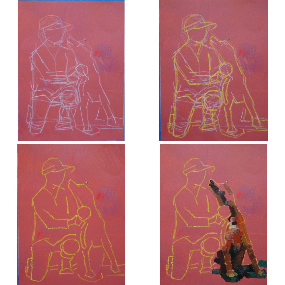
So I thought I would share one more - from my initial drawing to the final product. In this case it took about 45 minutes - kept fumbling with the drawing.


Panel is 6x8" Terraskin glued on to 1/8 " door-skin and treated with black gesso warmed with red acrylic (see how I prepare at bottom of post). Initial drawing is water soluble pencil. I can easily wipe off and correct. Once I am happy I have used yellow China Marker for final sketch then spray down with water and remove white pencil.


Now trying to lay in the paint one spot at a time and trying to avoid blending - just side by side or overtop. 
Final product - it is what it is!


Preparing panels - for small pieces I use TerraSkin or linen or canvas glued on door-skin. I increasingly like working on dark surface for these small panels - not sure why but I do. In this case I use black gesso mixed with a bit of quinacradone red to warm it. I often add an acrylic to the gesso to give it colour. I use a small cheap disposable foam roller to apply and it gives a nice even surface with some "tooth". I do not like painting on smooth surface - I like SOME tooth. 


 I cover the roller with a small disposable glove and it keeps moist and usable for many days. 

Saturday, 14 January 2012

Don't throw out that paint!

With Soltek clipped on 


I had a visitor to the studio today. I showed her my set up and we got to discussing a number of practical things. One of the things she asked was how much paint did I waste. The answer  was   - nearly none. The methods I use were new to her so I thought I might share them.


I often refer to the fact that I have had the good fortune to study with many fine artists. And that if there is something they had recommended in common that it would be foolish not to think it worth paying attention to. One such thing was - putting out lots of paint. In my first few years I often scrimped on paint and, as my instructors said would happen, in the midst of a painting I often made do with what was there instead of stopping to reload. The results spoke for themselves. Now, whether oils or acrylics I put out lots of paint and have developed strategies that work for me to avoid wasting what I don't use.


My new Coulter Art Box 


Guerilla box and palette with oils 
For oils it is simple: I separate my holding palette from my mixing palette. I use a smaller plastic palette onto which I squeeze my paints. That palette sits alongside my mixing palette (normally glass) and I simply take from my holding palette as needed. Using oils I have tried to premix most of my colours, particularly plein air, so it works well taking with the palette knife  and placing onto the mixing surface. At the end of the day, I cover the holding palette and place it in the freezer until needed. Works well and paints stay usable for a considerable time.  The two most common holding palettes I use are the 5x7 and 8x11 palettes from Guerilla Painter and the 8x7 " palette from Masterson Art Products.  Both have lids
Masterson 


9x12 Guerrilla Backpackerâ„¢ Covered Palette Tray
Guerilla 
Easy L with palette attached with velcro
For mixed paint on my mixing palette I scrape off at the end of the day and place that MUD onto my holding palette and use as required the next day - often adding another colour to change the direction of the hue and value as required. Rarely is anything wasted.


When using acrylics I also have a  holding palette and a mixing palette whether plein air or studio. For plein air I use the same Masterson Sta-Wet palette as above but add the sponge and paper to keep the paints moist. I generally squeeze my tube colours onto that palette (mostly opaques). My transparents are generally liquids and I squeeze them onto the mixing palette as needed.


Using the Alla Prima System with acrylics
For studio acrylics its the same thing just on a larger scale. I hold my tube paints in a Sta-Wet 12x16 and mix on a large glass surface.  


So with acrylics, the paints stay active in the Sta-Wet for many days to weeks and I use most of what I put out. When I need to change the Sta-Wet and there is paint left over I have two uses: I either use it to apply (adding either mat or gloss medium)  to the surface of a group of pre-made panels creating an under-painting for future use or I store it.  I normally have up to 20 or more small jars with acrylic paint in pre-mixed grays that I commonly use - sky mixes, typical warm grass colours etc etc. I paint the top of the jar with whats inside and then know the colour and final value I will get and have a value reference point from which to work back from often modifying the temperature while holding the value as required. So the old paint is placed into these containers. White added as required to adjust value and staining colours added to change the hue, complements added to modify the saturation etc etc - the paint lasts pretty much indefinetly as with normal jared acrylics if managed correctly.


My studio palette setup  for acrylics


I'm sure there are as many solutions to saving paint as there are artists. This is what works for me.

Oh, and I don't want to hear anything about the number of plein air systems I have - get enough of that at home !